It’s hard to believe a new year is nearly upon us, but according to beloved paint brand Sherwin-Williams, 2024 isn’t just on its way—it’s going to float in on a cloud of joy and optimism.
The brand announced Upward, a calming grey-blue, as their official 2024 Color of the Year selection today, and there’s no denying that the shade is both beautiful and tranquil. In fact, the brand predicts alongside their 14th Color of the Year pick, we’re all in for a blissful, breezy, and clear-headed 2024.
“Upward brings to life that carefree, sunny day energy that elicits a notion of contentment and peace,” Sue Wadden, director of color marketing at Sherwin-Williams, tells The Spruce. “With this color, we invite consumers to pause and infuse a new sense of ease and possibility into their spaces—one that doesn’t overwhelm, but rather establishes meditation and tranquility.”

It’s Perfect for Respite Spaces
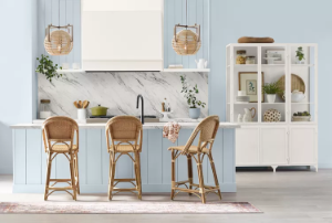
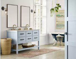
In a conversation with Wadden, we asked for her personal favorite uses for Upward. She sees it working anywhere you need a light and airy touch of joy and happiness. She particularly suggests trying it on kitchen cabinets for a refresh, as a pop of color on your trim or doors, or in your bathroom against crisp, white marble countertops.
“Blues are always really useable, across the globe,” Wadden says. “People have such positive connections with blue, so it can be used in many, many applications. It’s a soothing color for respite spaces, too—the places where you need to kick back and shut off the screens.”
It Balances Well With Warmer Tones
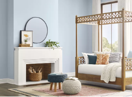
Wadden also notes the shade features a touch of periwinkle in its undertones, making it a blue that works beautifully with warmer tones, like the 2023 Sherwin-Williams Color of the Year, Redend Point. Warm, wood tones pair wonderfully with the light, cloudy blue, as well as powerful neutrals like black and white. As seen in the below bathroom, it reads perfectly earthy and light.
But while Redend Point was picked for its warmth and earthiness, Upward is here to bring buoyancy and weightlessness. In fact, in its release, the brand says, “it’s an invitation to open minds to a color of ethereal calm that is ever-present—if we remember to keep looking up.”

It’s the First of Many Coastal-Inspired Trends
Along with bringing more positivity into 2024, Wadden told us another prediction: Upward will be ahead of the trends, because she expects a return to coastal aesthetics in the coming years.
“We’re seeing a lot of interest in a coastal vibe, and I think coastal and lakehouse aesthetics will return and chip away at farmhouse modern,” she says. “There’s a lot of energy around coastal chic coming back which is something we thought about when we picked Upward.”
Regardless of how you use the shade in your own home, Wadden says the whole point of Upward is to create a fresh feel for the year ahead.
“It’s a really joyful color—it fosters happiness, focusing on the positive and all good things,” she says. “That’s what we want to push forward in 2024, and Upward really fits the bill.”

Embracing the Inspiration Everywhere
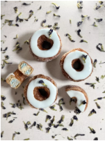
In anticipation of the launch, the brand even went in a fresh direction to bring the hue to consumers…freshly baked, in fact. With the help of James Beard Award-winning French pastry chef Dominique Ansel, visitors to his namesake bakery in New York City can try a specially prepared Upward Cronut inspired by Upward SW 6239.
“At first glance, Upward SW 6239 draws up a sense of balance and lightness for me,” Ansel says. “I can’t wait for our guests to try it and open their eyes to finding inspiration all around—even where they least expect it.”
Any questions please feel free to ask me through Andrew@sinotxj.com
Post time: Jan-04-2024


